BRAND KIT.
Everything that makes GolferHD look and sound like GolferHD — color, type, voice, and the rules that keep it consistent across every round writeup, social post, and partnership deck.
src/styles/global.css Brand Essence
In one line
The public record of one golfer getting better — honest, data-driven, no vanity scores.
Built around the 5 by 50 challenge: reach a 5 handicap before turning 50, from a starting point of 23, with the whole process documented in the open.
Taglines
- Not the score — the system.
- Getting better, on the record, forever.
- The long game.
Personality
Voice
- Plainspoken. Say the thing. No hedging, no hype.
- Numbers first. Claims are backed by data — strokes gained, launch numbers, handicap deltas.
- Self-critical. Name the bad shots. The misses are the point.
- First person, present pursuit. This is happening now, not a finished story.
Avoid (AI-writing tells)
- No antithesis tics — "It's not X, it's Y" used as a crutch.
- No dramatic one-line fragments for effect.
- No rule-of-three triads stacked for rhythm.
- No preachy closers or motivational sign-offs.
- Em-dashes are fine — used sparingly, not as a verbal tic.
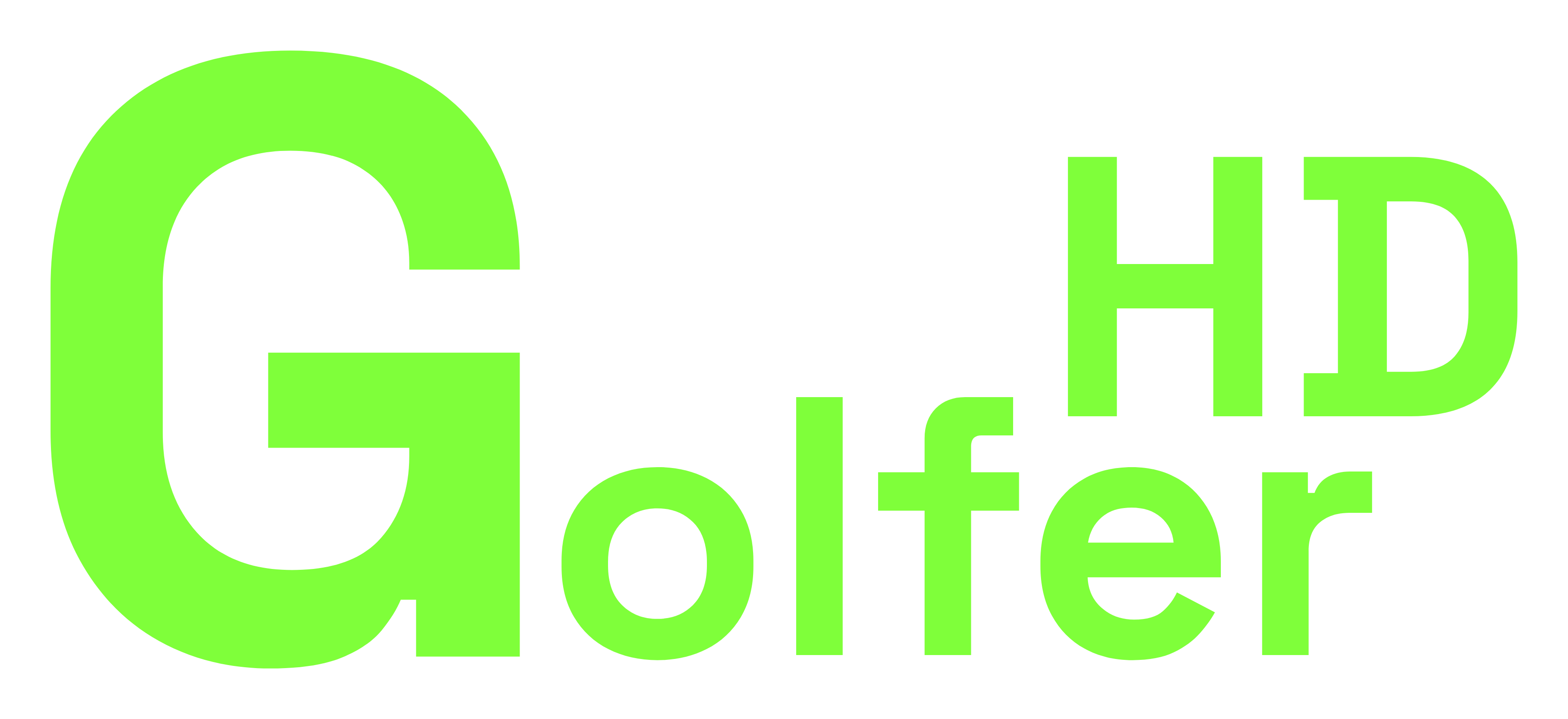
Logo & Wordmark
GolferHD is a wordmark, not a symbol. It is always set in Space Grotesk, black weight, italic. On dark it runs solid lime; on light surfaces — a golf ball, white merch, print — it gets a black outline so the lime keeps its edge. The favicon reduces it to a single italic G.
Primary — lime on dark
Default everywhere. Nav, footer, hero.
Reversed — on lime
Ink (#082100) wordmark on lime fills.
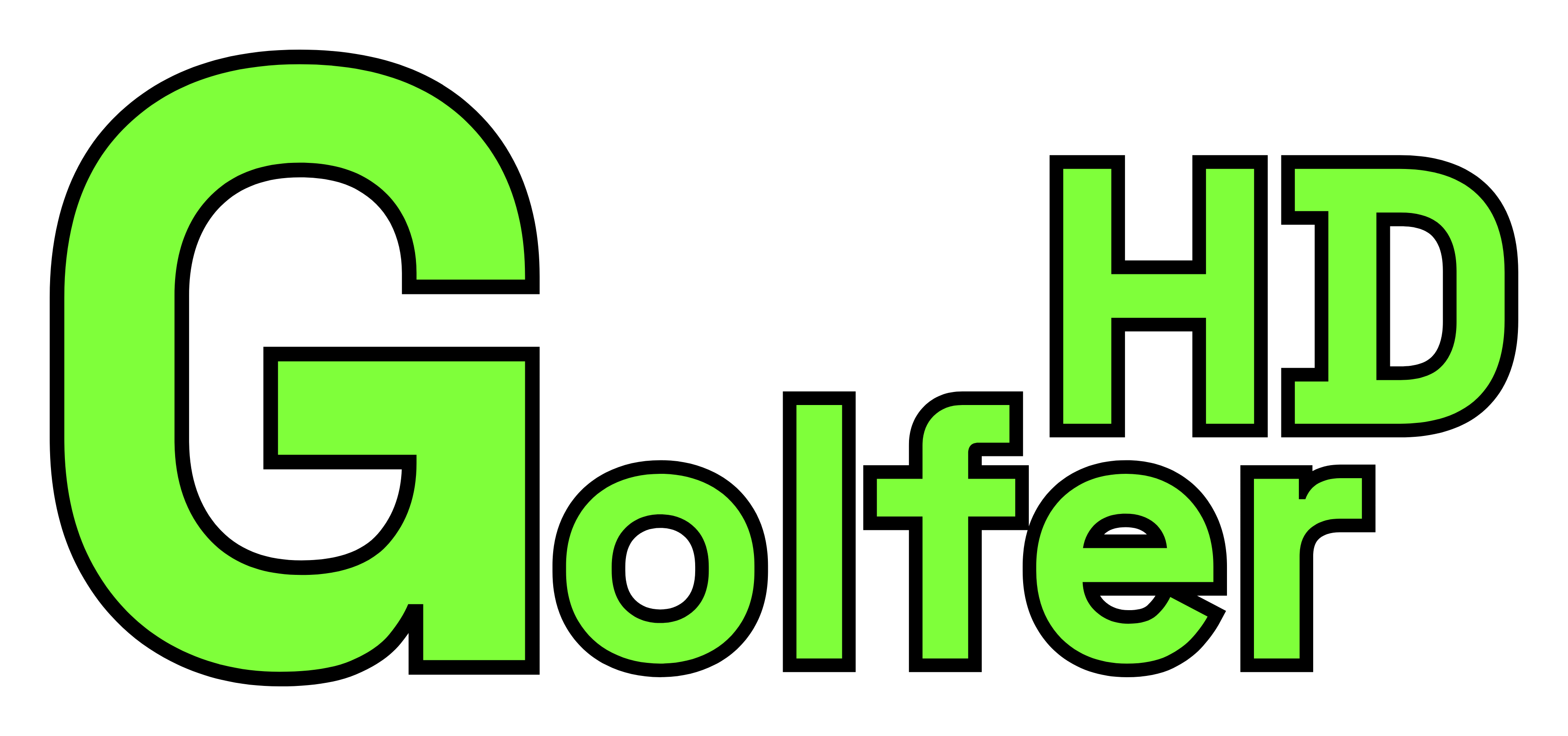
Light — lime + black outline
For white/photo backgrounds. logo-wordmark-light.svg
Ball / merch — the use case
Clean outlined wordmark, no lockup. logo-wordmark-light.svg
App mark — favicon
favicon.svg · logo-square.svg
Monogram & Lockup
Compact marks for avatars, app icons, and ball stamps. Each shows lime-on-dark and the outlined light version side by side.
GHD badge — italic
“GHD” stacked with “olfer” below. The signature.
GHD badge — upright
Same stack, upright. Steadier, more corporate.

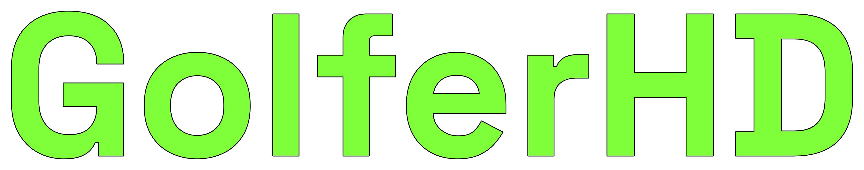
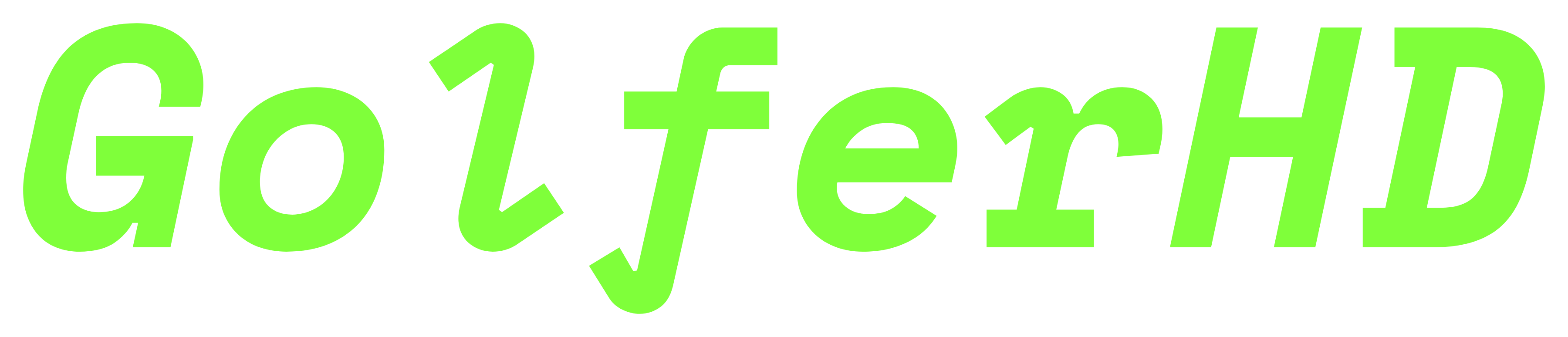
GolferHD — wordmark
Single line. For horizontal lockups and headers.
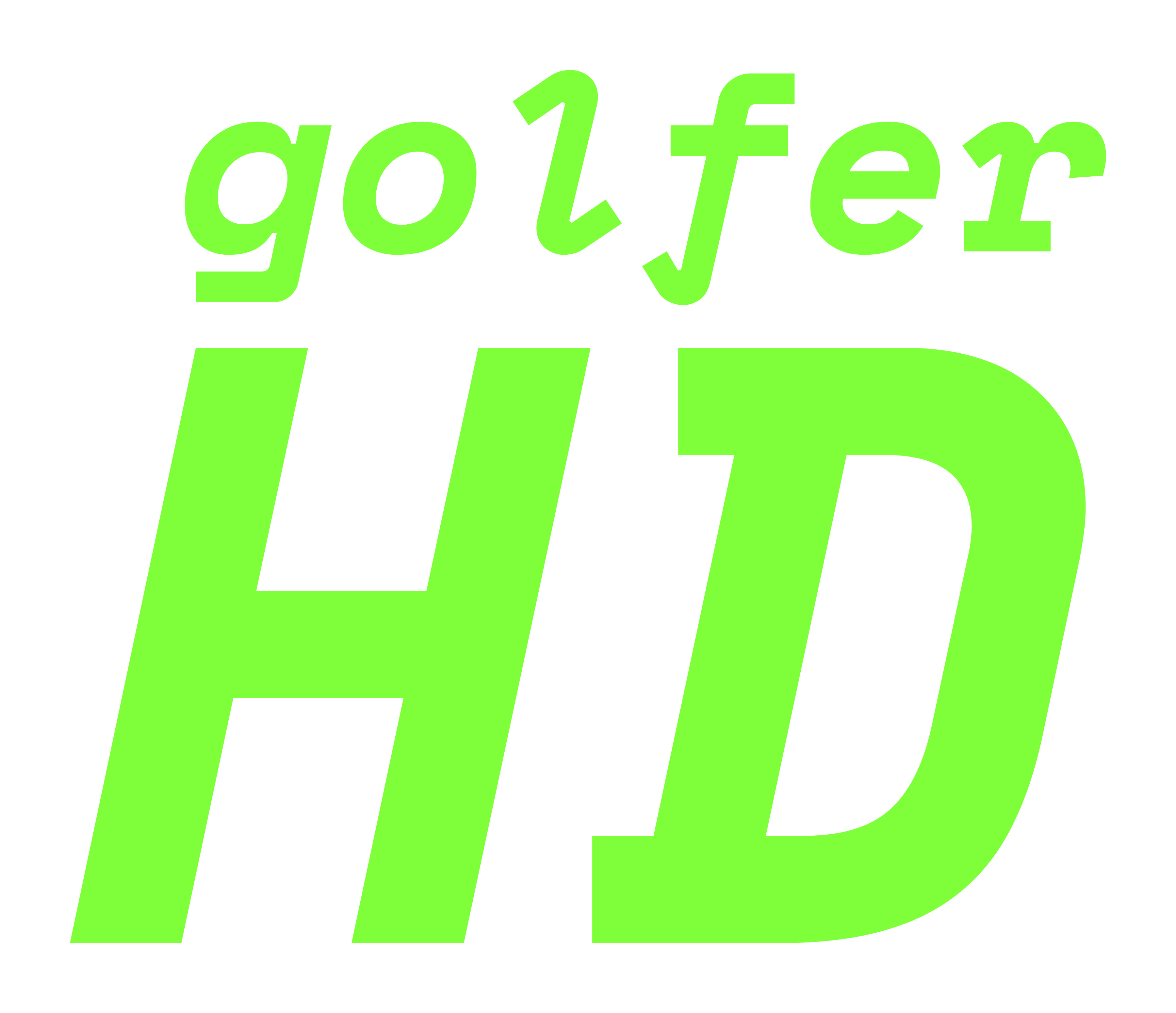

GolferHD — stack
“golfer” over a bold “HD”. Compact and italic, profile-ready.
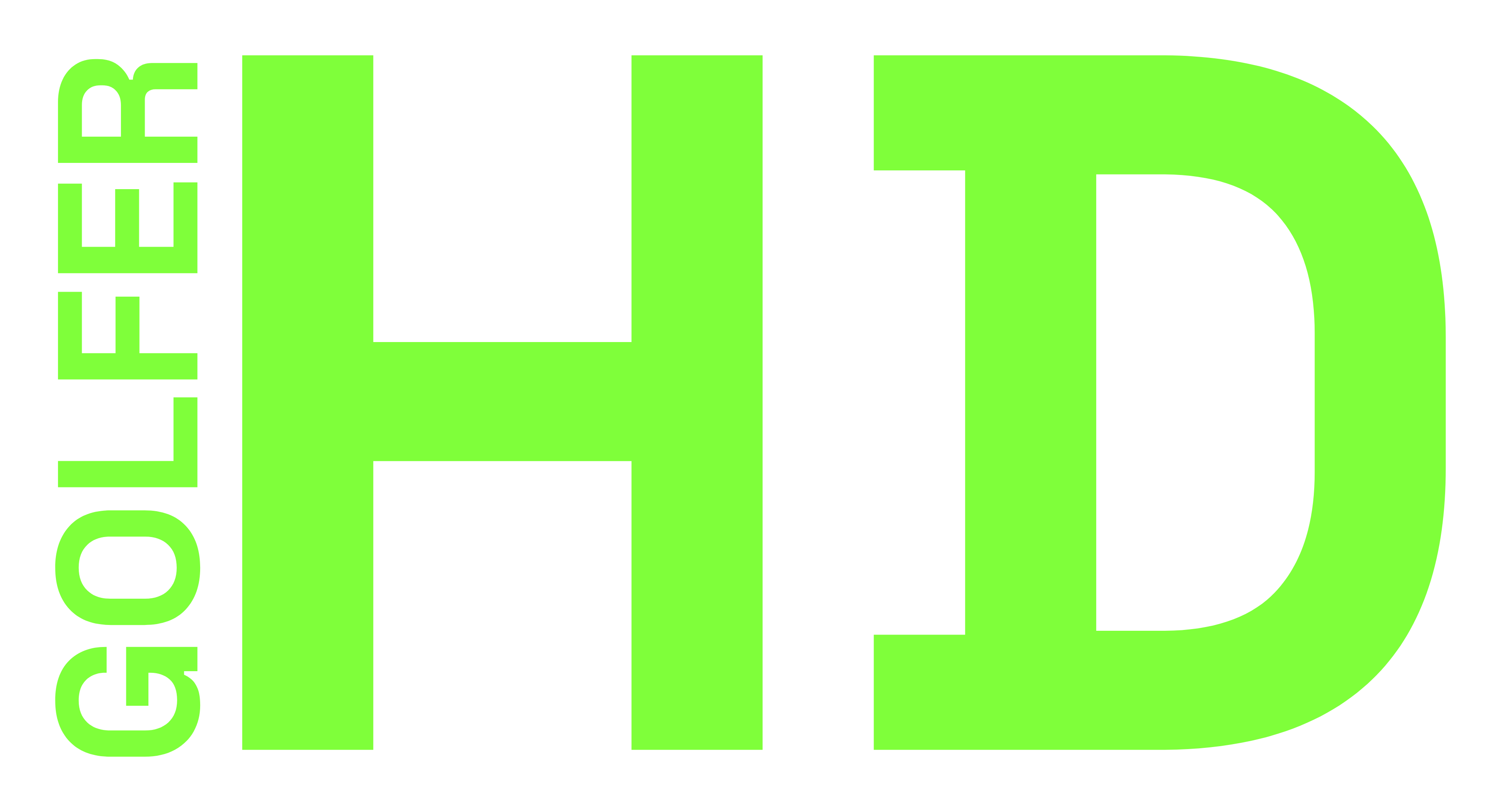
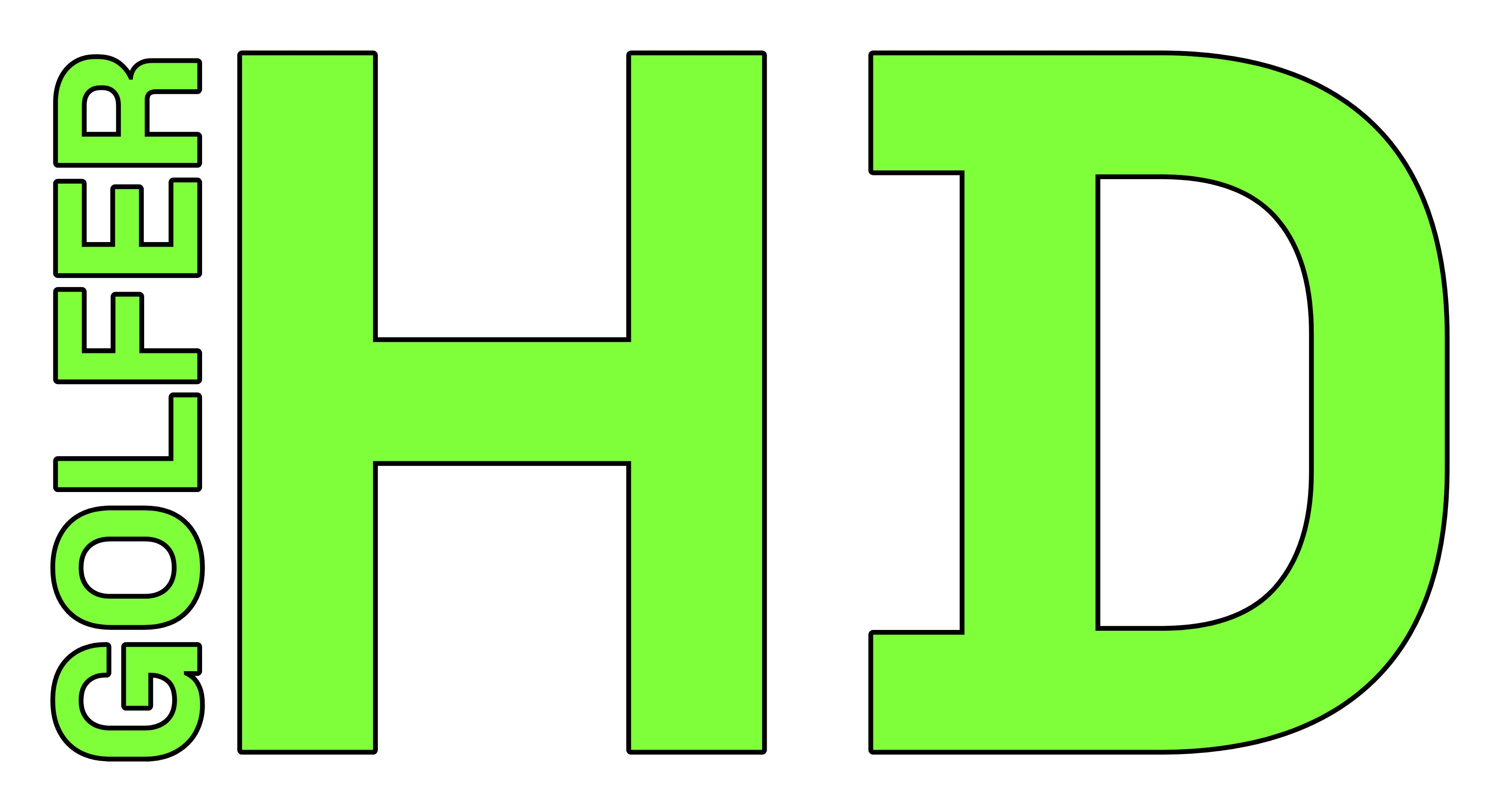
GolferHD — vertical
Vertical “GOLFER” against a big “HD”. A bold sidebar lockup.
GolferHD — superscript
RecommendedBig “Golfer” with a raised “HD”. The primary horizontal logo.

GolferHD — italic
Single line on a slant. The italic cut of the wordmark.
Download · Wordmark
Download · Monogram
Each monogram also ships as a matching SVG (same filename, .svg).
All PNGs are transparent. The wordmark SVGs use Space Grotesk (Arial Black fallback) — convert text to outlines for vendor print. The monogram marks are already outlined vector paths (Space Mono), so they need no font anywhere.
Clear space & minimum size
Keep clear space equal to the cap-height of the G on all sides. Never set the wordmark smaller than 88px wide on screen.
Do
- ✓Keep the wordmark italic, black weight, lime — that is the whole identity.
- ✓Lead with one signal color. Lime earns attention because it is used sparingly.
- ✓Let dark surfaces breathe. Generous padding, big type, lots of background.
- ✓Use the lime→mint gradient only on key words, never whole paragraphs.
- ✓Type content with the four category accents (lime, mint, amber, purple).
Don't
- ✕Don’t recolor the wordmark or set it upright/non-italic.
- ✕Don’t use pure white (#fff) for body text — use on-surface (#e3e2e2).
- ✕Don’t introduce new accent hues outside the token set.
- ✕Don’t put lime text on light surfaces — it fails contrast.
- ✕Don’t add drop shadows or glows to the logo.
Color System
A near-black canvas with one electric signal color. Click any swatch to copy its hex. CSS custom properties are the source of truth — reference tokens, not raw hex, in code.
Primary — Neon Lime
The signal. Used sparingly so it always means "look here."
Secondary — Mint
The gradient partner. Pairs with lime in text-gradient and kinetic-gradient.
Surfaces
Six-step dark hierarchy. Lower = recessed, higher = raised. Borders are white/5.
Type & Lines
Warm off-whites and sages — never pure white, never neutral gray.
Category Accents
Four left-border colors that type content by pillar (see /about).
Training
#7FFF3A
Round Recaps
#42E9A2
Gear & Tech
#FBBF24
Travel & Events
#C084FC
Contrast & Pairing
On-surface on background
#e3e2e2 on #121414 · passes AA
Ink on lime
#082100 on #7fff3a · passes AA
Lime on dark — large only
Never set lime text on light surfaces.
Typography
Headline
Space Grotesk
Weights 300–700. Set black (900 via font-black) for display, often italic for the wordmark, tracking-tighter on large sizes.
Body
Inter Variable
All running text and UI. Regular for body, leading-relaxed, on-surface-variant for secondary copy.
Display
Space Grotesk · Black 900 · tracking-tighter
H1 / Section
Space Grotesk · Black 900 · tracking-tight
H3 / Card title
Space Grotesk · Bold 700
Kicker / Eyebrow
Space Grotesk · Bold · uppercase · tracking-[0.4em]
Body Large
Inter · Regular · leading-relaxed
Body
Inter · Regular
Signature pattern — gradient accent word
THE LONG GAME.
Set the final word in text-gradient (lime → mint). One accent word per headline — never the whole line.
Components & Utilities
Buttons
Hover: hover:scale-95 — buttons shrink, they don't lighten.
Stat chip
glass-panel
Frosted over gradient
backdrop-blur(12px) on translucent dark.
bento-card
Hover me
Lifts 2px, border goes lime/25 on hover. The default content tile.
kinetic-gradient
135° · #7FFF3A → #5CFEB4 · fills & backgrounds
text-gradient
left→right · #7FFF3A → #5CFEB4 · clipped to text
Imagery
Sourcing & delivery
- All images served from
cdn.ascenhd.comvia the Asset Vault. - Real photography only — actual rounds, courses, gear, and launch-monitor screens. No stock golf clichés.
- Square crops for profile/cards; 16:9 for hero and OG; 9:16 for YouTube Shorts embeds.
- Always ship descriptive
alttext.
Treatment
- Round corners —
rounded-2xlon media tiles. - Float a stat chip or lime accent over the image to tie it to the system.
- Let dark UI frame the photo; don't overlay heavy gradients on content imagery.
- Lime is for UI, not photo filters — never tint photographs.
A brand under the AscenHD umbrella. Tokens live in src/styles/global.css — edit there, then update this page.
v1.0 · June 13, 2026
Questions: [email protected]